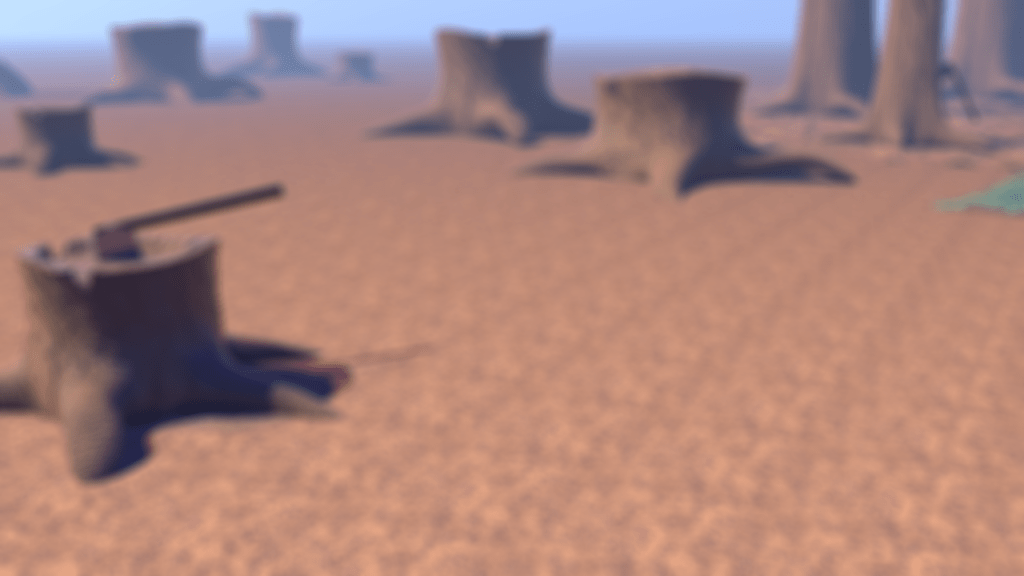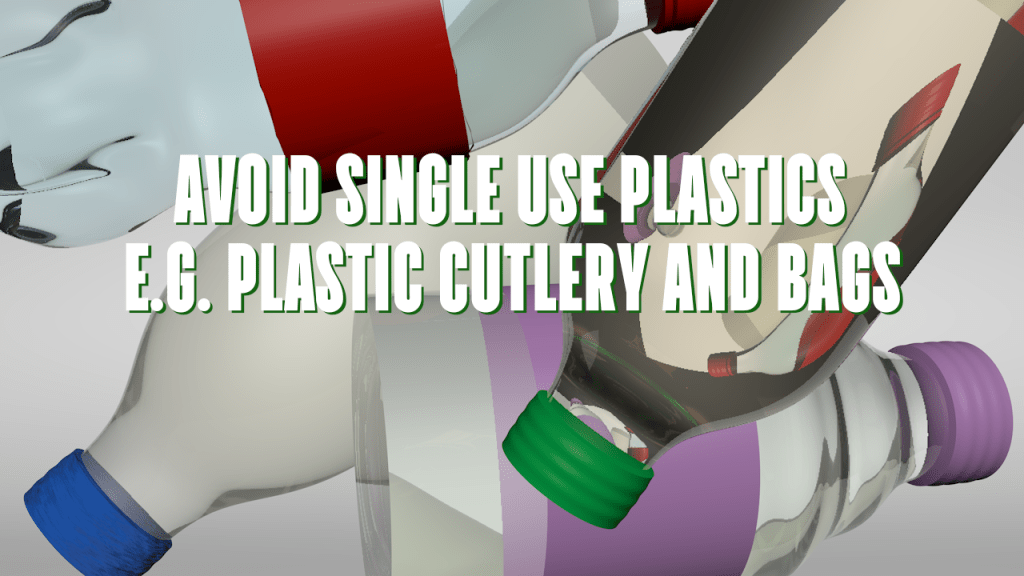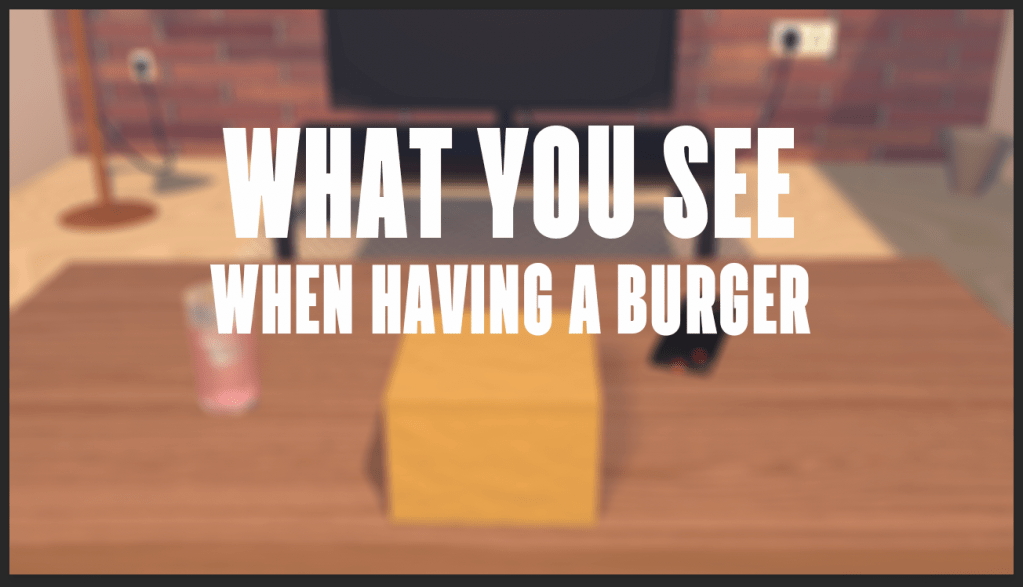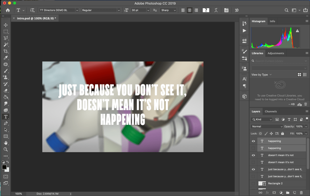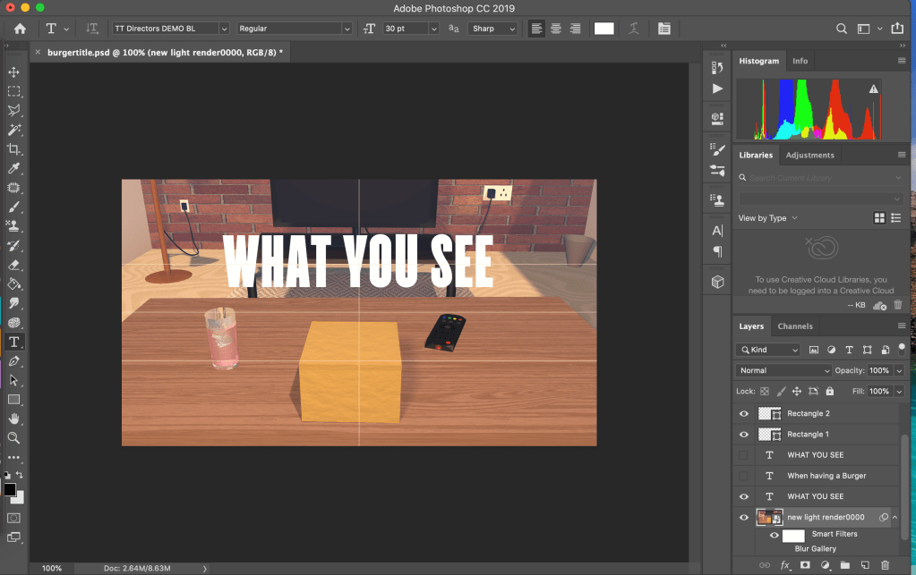
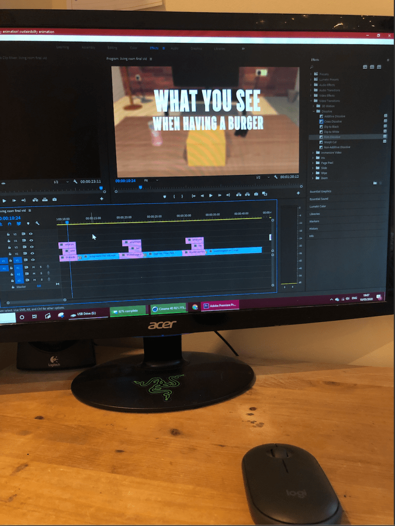
For the titles I used the first image of each scene and blurred it slightly so the text would stand out more. I played around with a few bold fonts to see which one I liked the best. I picked the font because it was bold and easy to read but the letters are also slim so they don’t take up the whole of the image in the background meaning when I faded the blurred image to start the animation playing it looked better being able to see some of the background first.
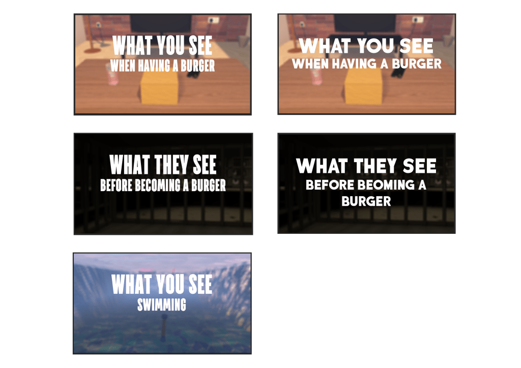
Image if my two different title designs, I was comparing the two different fonts.